Context
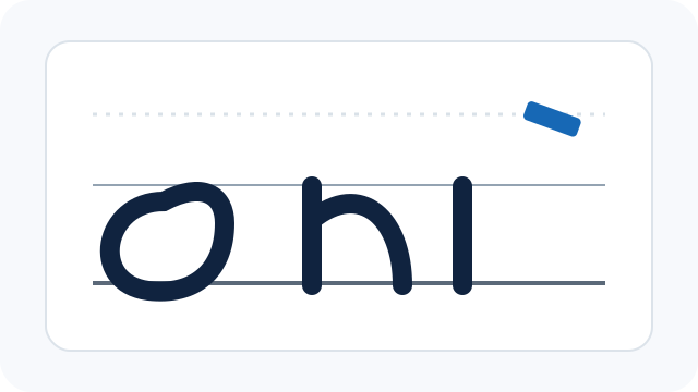
A practice sheet is not just a set of equally spaced rules. In broad-edge Latin calligraphy, the lines describe zones in which different parts of a letter live. Learning those zones first makes the page much less mysterious.
The four-line row
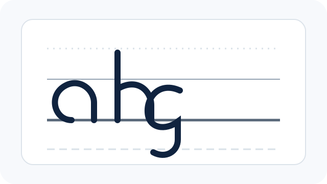
CalligraphyToolkit repeats the same sequence in every row: ascender limit, x-height, baseline and descender limit. The main body of a lowercase letter such as a sits between x-height and baseline. A d rises toward the ascender line; a g or p may descend below the baseline. The exact proportions vary by hand and exemplar, so the generated sheet is a starting point; other methods may use different proportions.
Why the lines look different
The lines use different styles so they are easy to tell apart. A dotted ascender, thin solid x-height, darker baseline and dashed descender can be distinguished even when adjacent rows are close. Slant guides, when enabled, are diagonal references only; they do not replace the horizontal structure.
Print scale matters
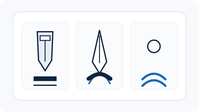
The 50 mm bar is a physical calibration mark. Print at 100% or “Actual size” and measure it with a ruler. If it is not 50 mm, the browser, PDF viewer or printer has scaled the page and the nib-width geometry is no longer trustworthy.
Sources and further reading
- Maureen Peters — Calligraphy Workbook for Beginners (publisher page)
- Washington Calligraphers Guild — Sheila Waters
These notes are based on the sources below. For deeper study, check the original source and a good reference alphabet or teacher.