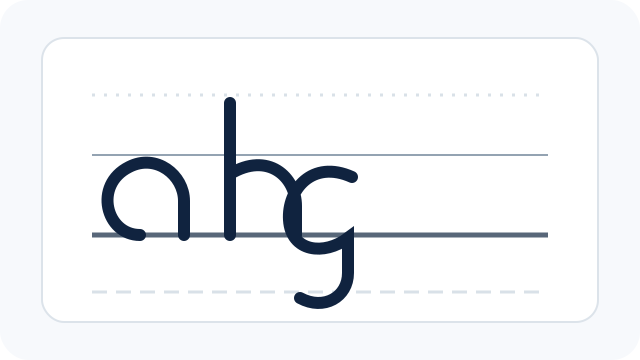
Context
Italic is often recognised by its forward movement, but slant alone does not create a convincing Italic hand. The underlying structure, spacing and broad-edge contrast have to work together.
Two angles, not one
Keep nib angle and letter slant separate. The broad edge creates stroke contrast; the letter skeleton may lean independently. CalligraphyToolkit deliberately provides separate controls so a learner can follow the values used by a chosen exemplar.
Build families of forms
Practise related letters together rather than memorising an alphabet as isolated drawings. Repeated arches, diagonals and joins reveal rhythm. Peters’ beginner book includes Italic step by step, and Waters gives extensive attention to Italic and its variations.
Spacing is part of the letter
Italic becomes difficult to read when narrow letters are packed without consistent internal and external space. Short words are more useful than a page of single letters once the basic strokes are stable.
Sources and further reading
- Maureen Peters — Calligraphy Workbook for Beginners (publisher page)
- Washington Calligraphers Guild — Sheila Waters
- David Harris — The Calligrapher's Bible (Bloomsbury)
These notes are based on the sources below. For deeper study, check the original source and a good reference alphabet or teacher.